
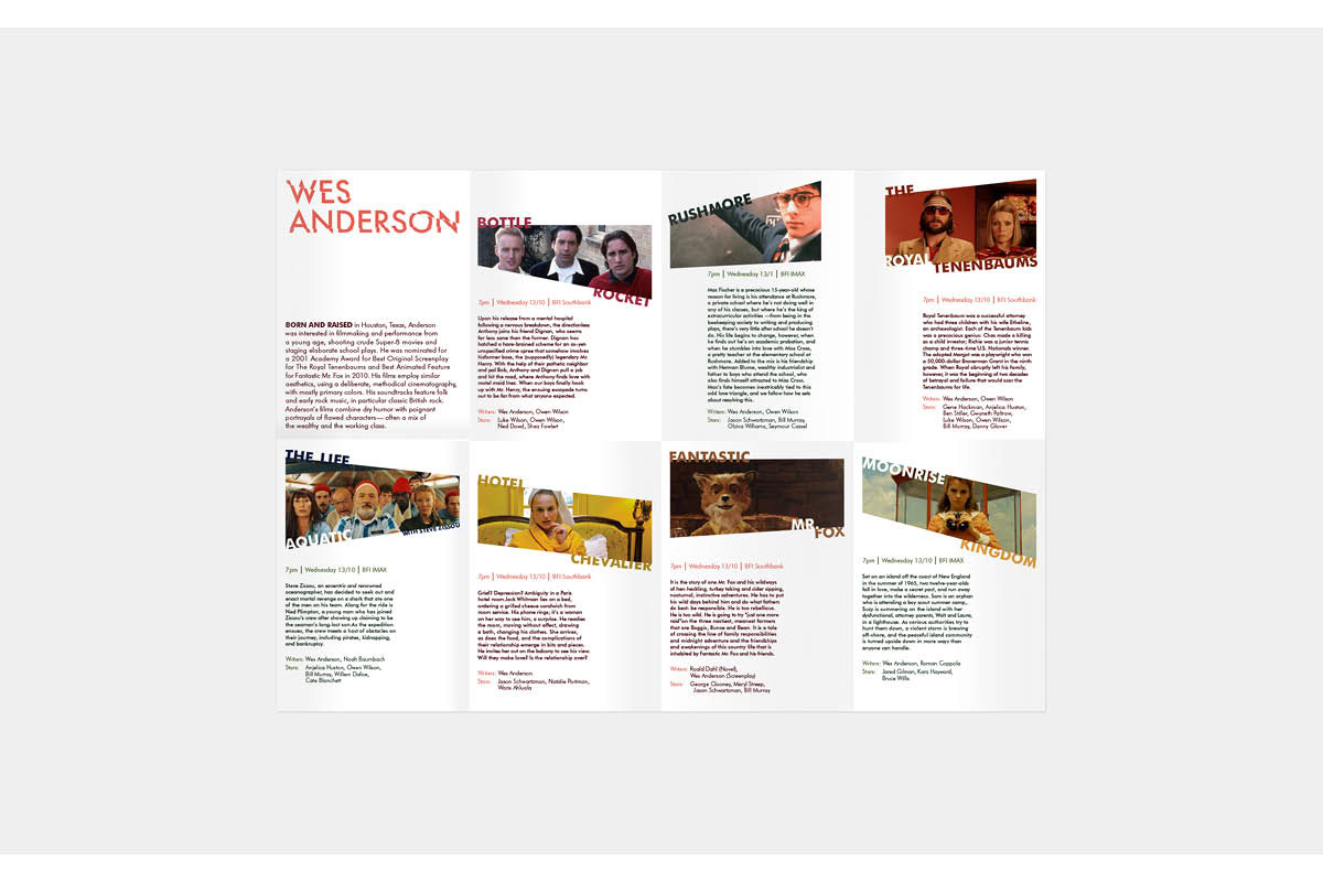
The images are cut, as if they were on a shattered piece of glass. This follows the concepts and wants to show how the characters are “broken”. To show at a glance in which of the two theatres the movie is played, I used two different colour palettes for the information.
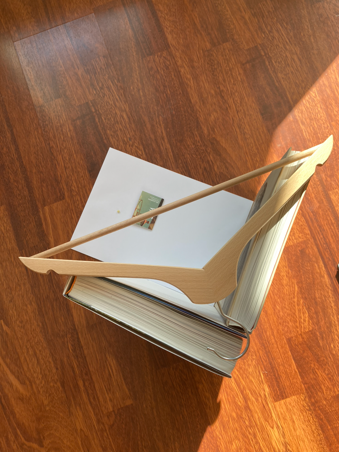
Just typo postcards I did as a take away or souvenir in the event and one of the posters promoting the event.
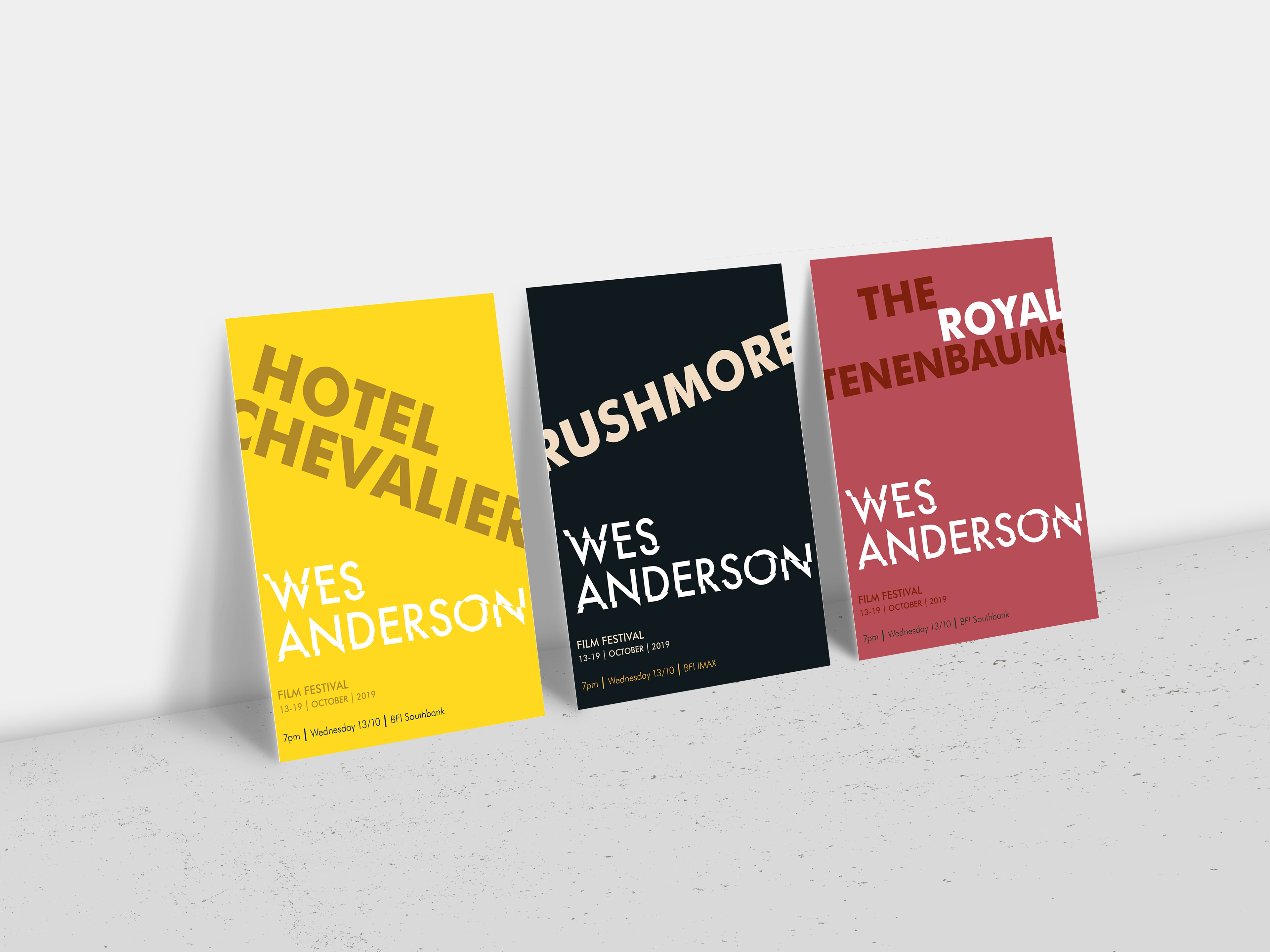
Typographic postcards
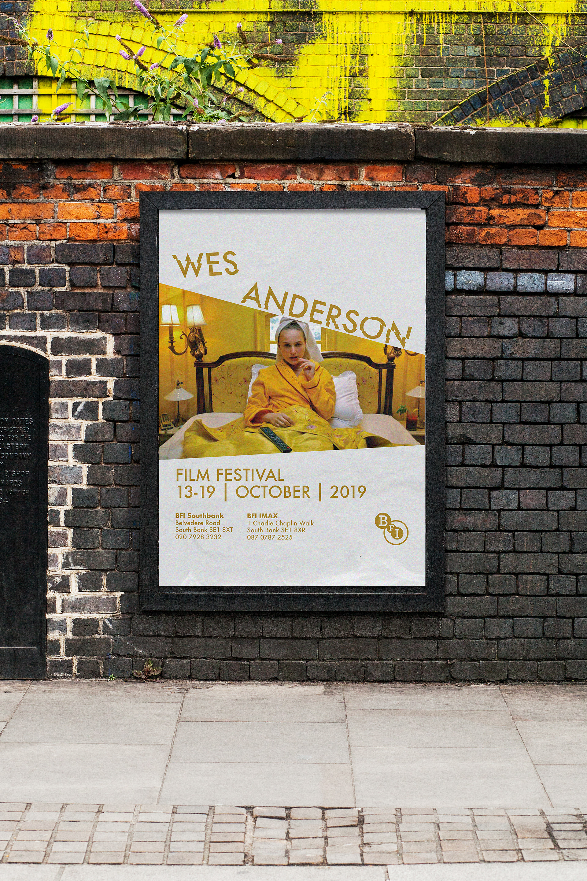
Publicity poster for the film festival
Stop motion to show the user experience of the brochure and the behind the scenes of the "studio" for the takes.
-Student project-