
The main logo is grey, so it reflects being a canvas where other colours can be applied. I also created a colourful palette which reflects the contact with nature, which is also part of the residency goal.
Are you interested in the project? Go visit their web site by clicking on their logo :)
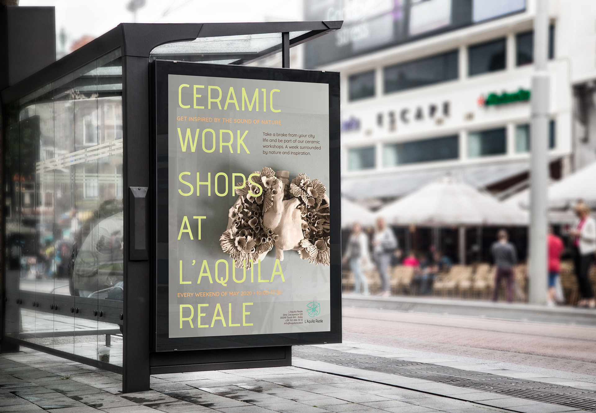
Mock up to present the idea to the client and show them a possibility to promote their workshops and residency.
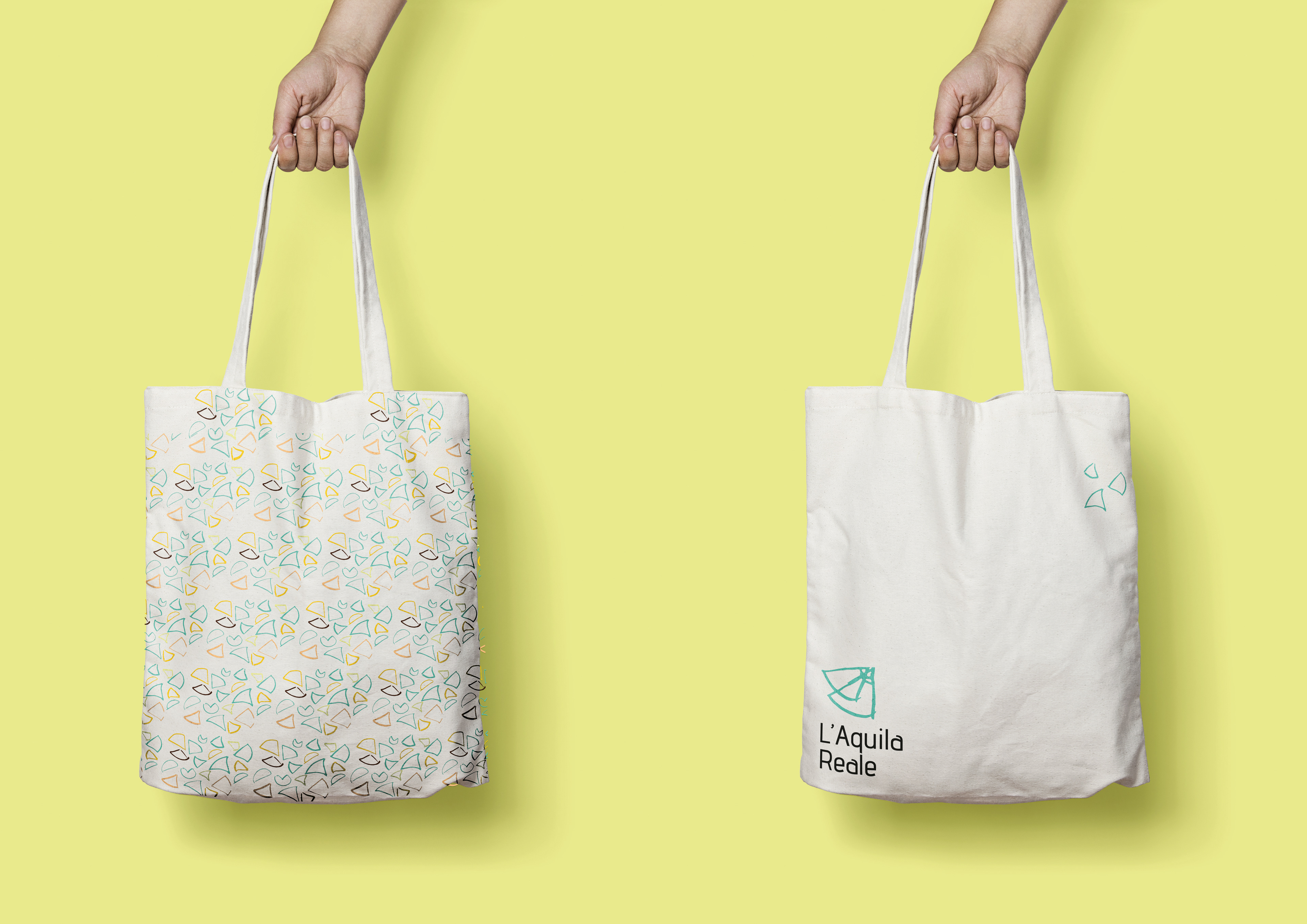
I took the logo apart and created this fun and playful texture with the little parts. The tote bag is also an example on how this could be implemented.
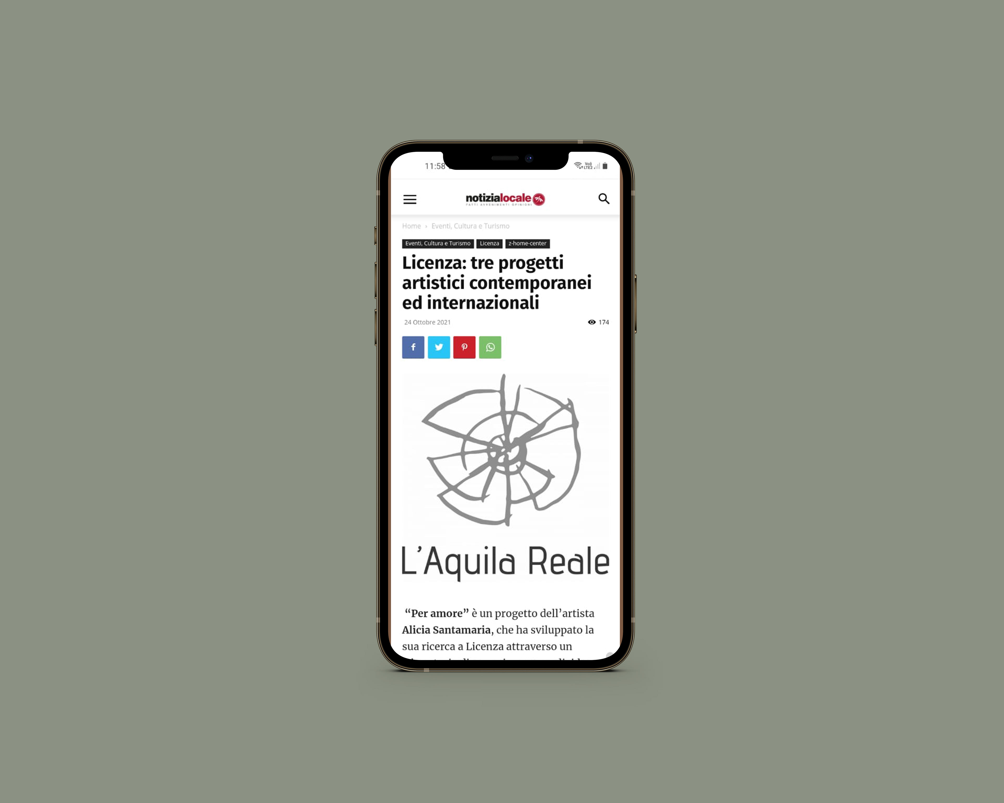
Article about the project in notizialocale.it
Little GIF I did just for fun.

-Freelance work-