
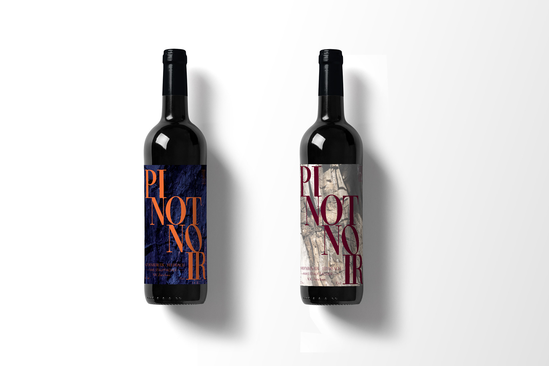
Wine label created for Hans Stauffacher for his limited annual edition of wines.
I wanted the label to represent his personality, humour and coolness. Hans is a very interesting person full of contrasts, making him like the Greek god Janus, who has to faces looking the opposite way.
I wanted the label to represent the clashing of forces and the opposition of elements. Two labels were created to represent the opposite directions Janus is looking at and to enhance the juxtaposition of different elements merging into one person.
Two etiquettes were created to reinforce the concept of duality.
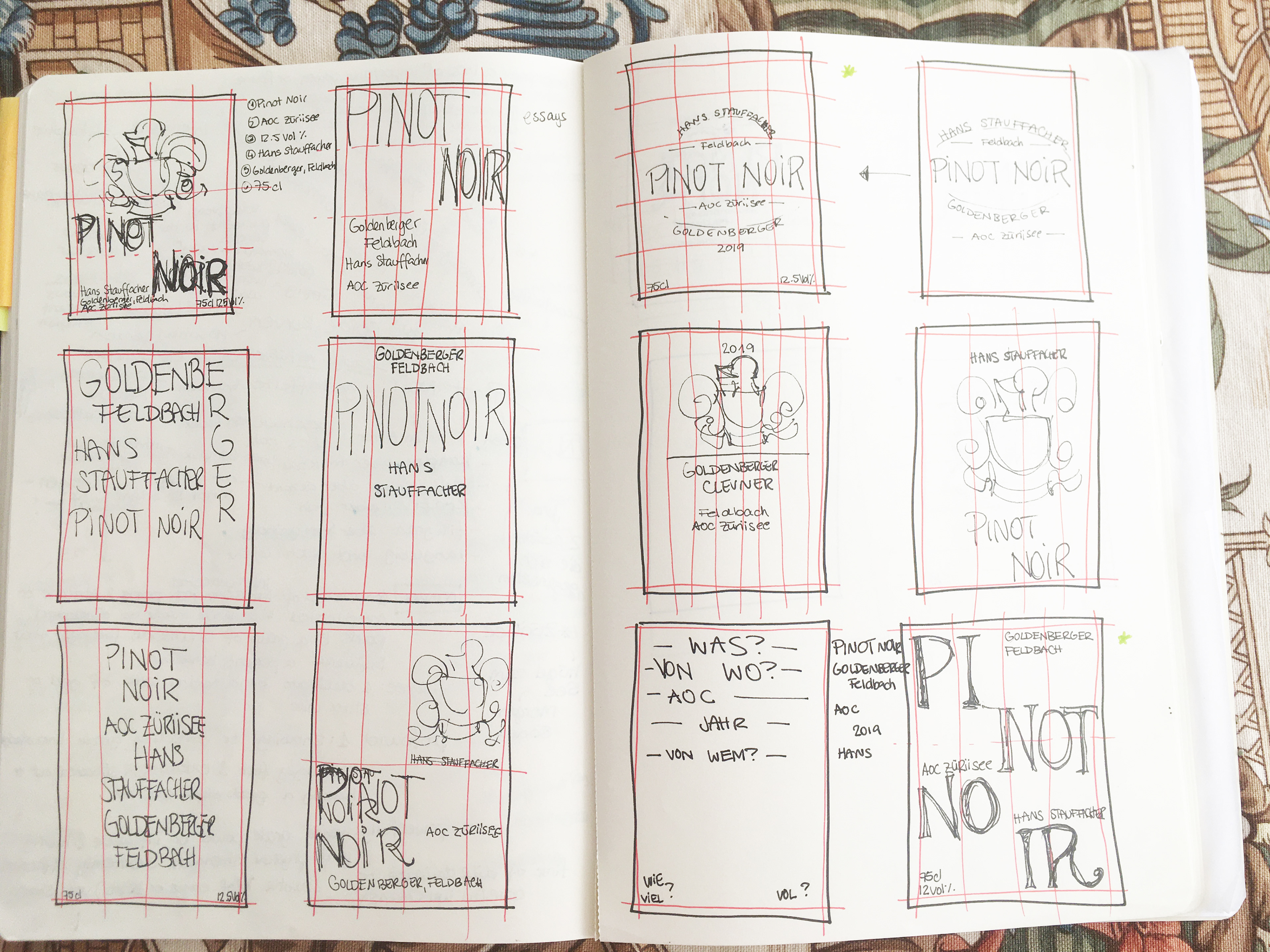
Behind the scenes: different thumbnails to explore different layouts.
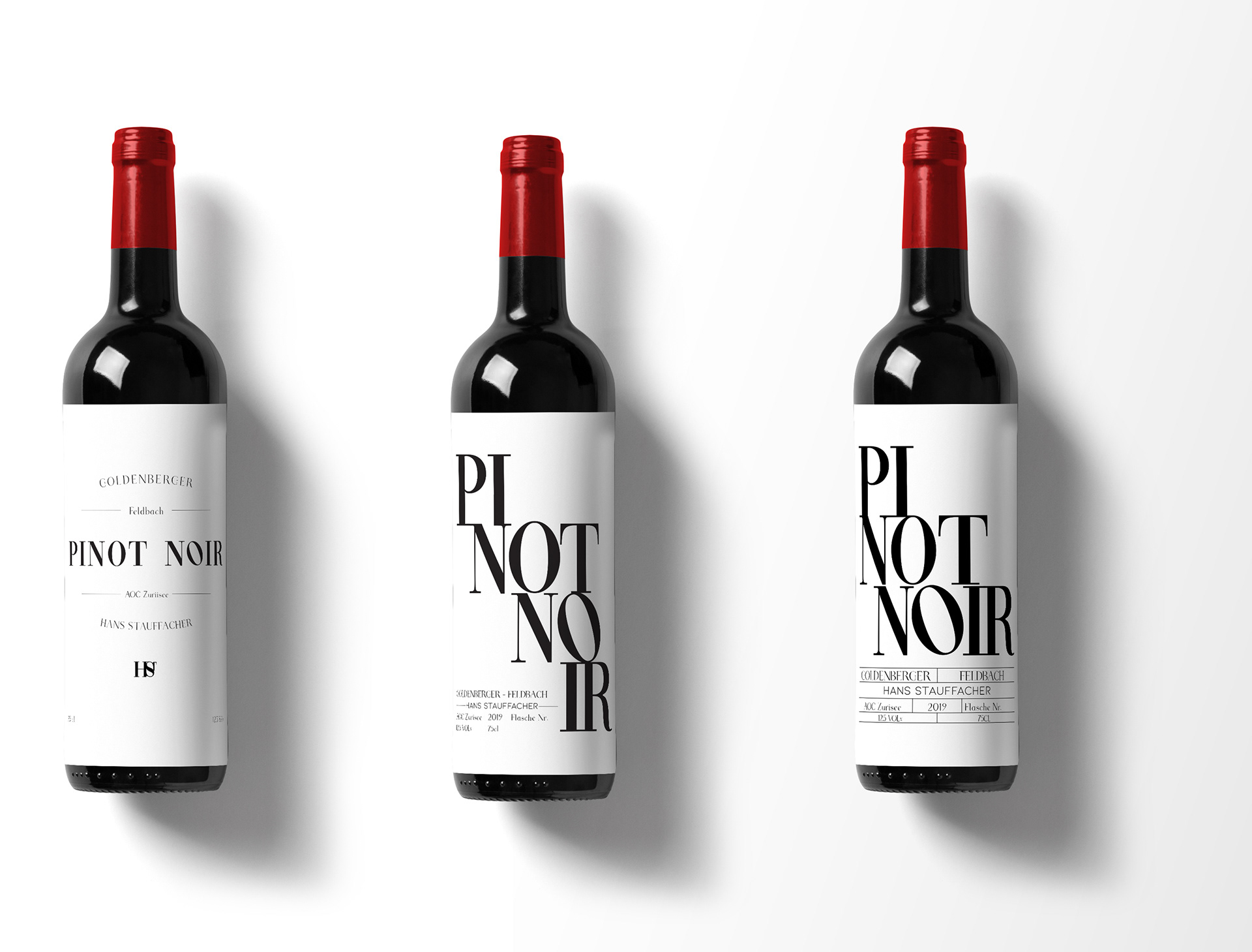
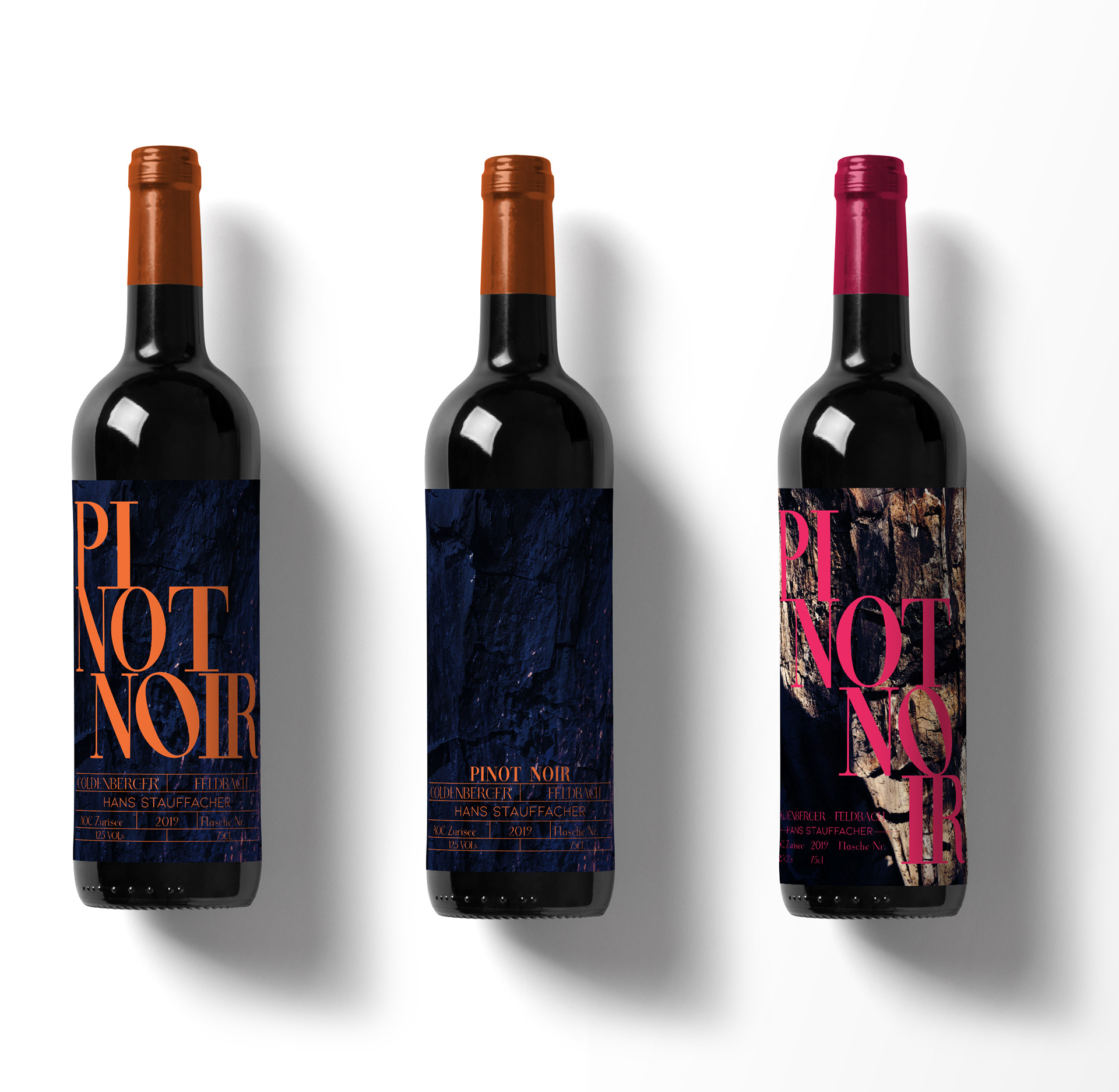
Once two main options and two secondary options were chosen by Hans, I started experimenting with the colour palette.
-Freelance work-