The colours reflect calmness uniqueness, creation and hope. The font should be modern, elegant and reflect a “ready for business” attitude.
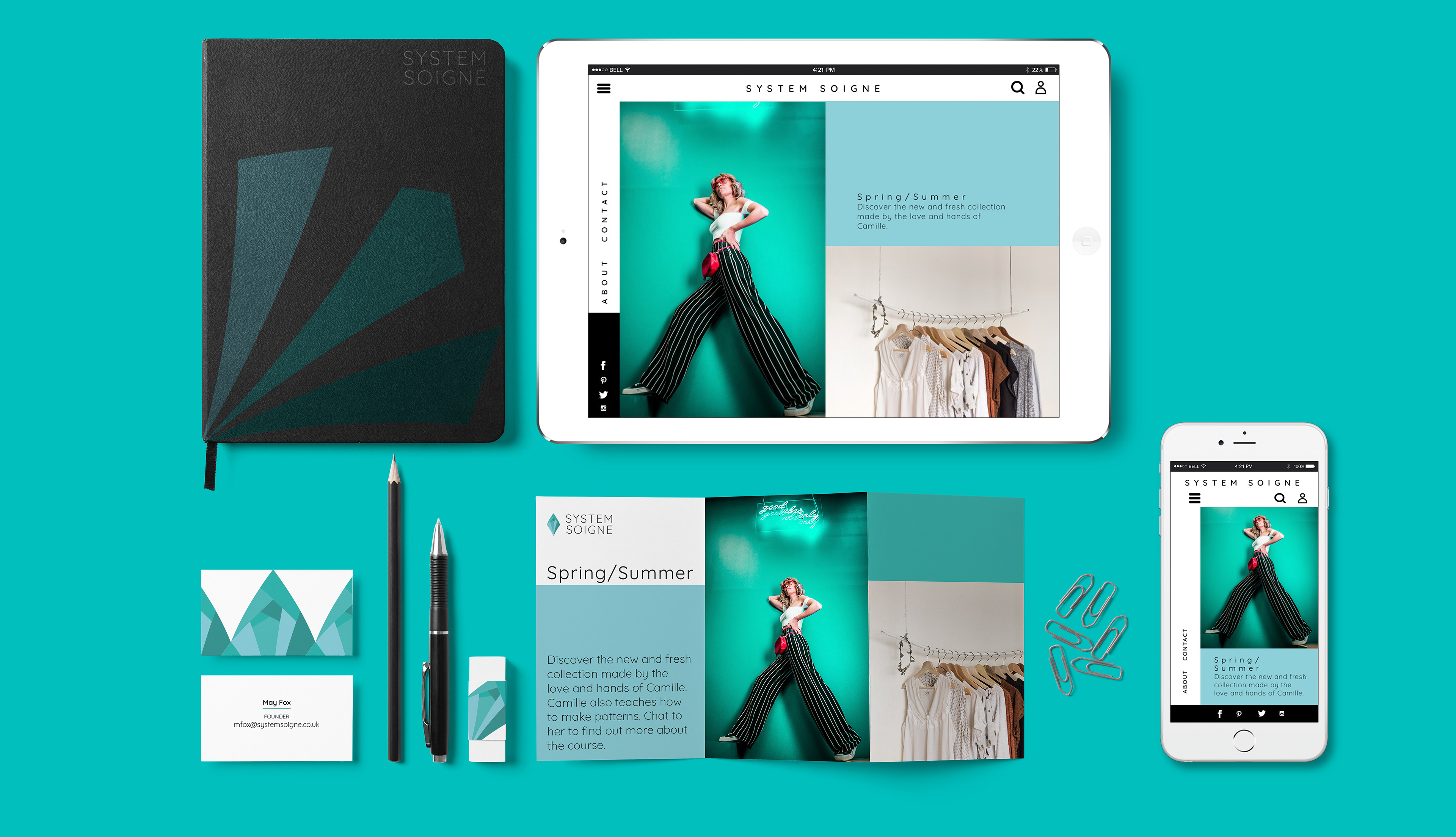
Different examples on how the roll out would be applied to different products of the gallery, like little signs, stationary and a canvas bag.

Supportive Logo

Different roll outs showing the possibilities of this creative space

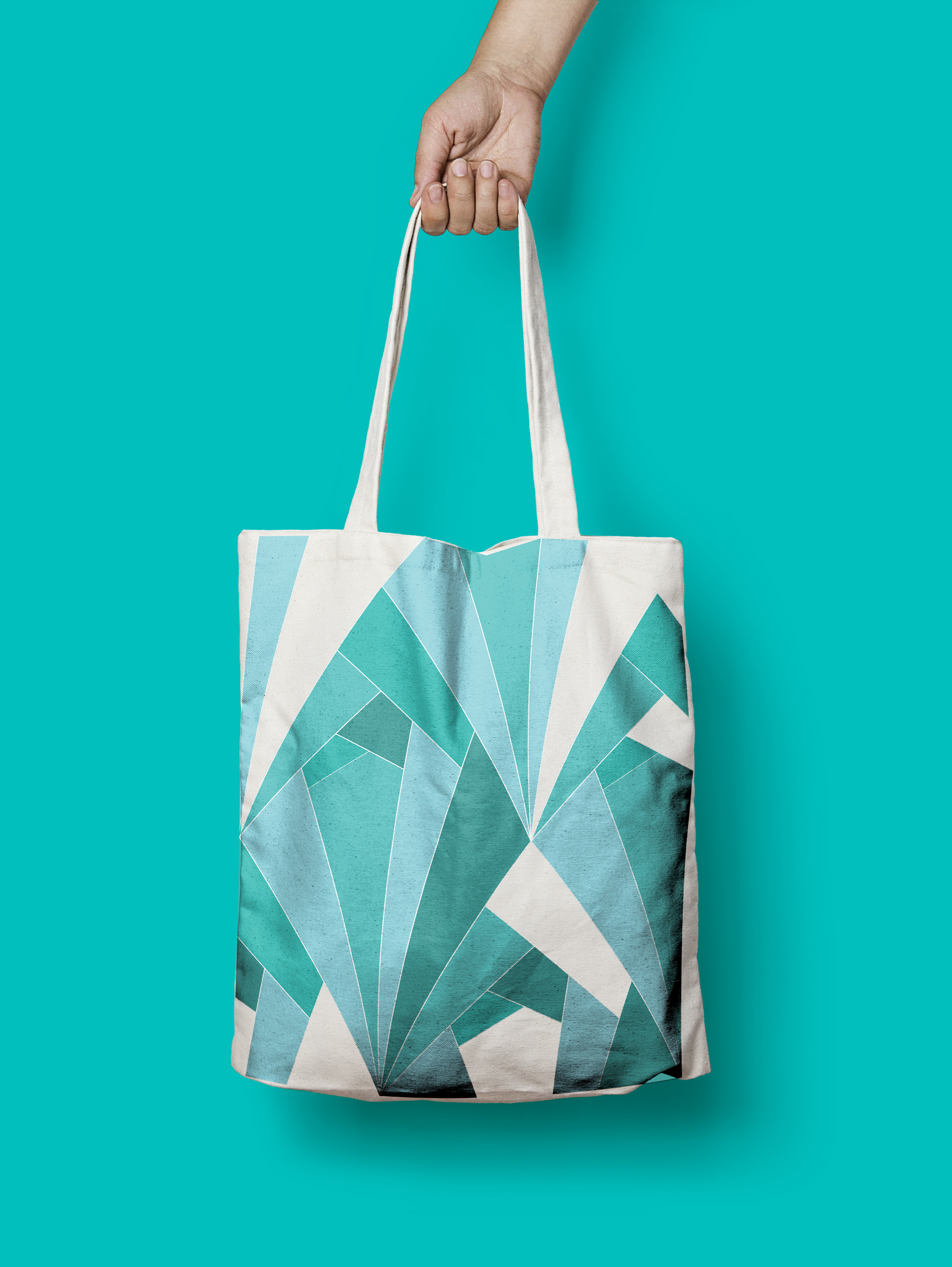
Tote bag
The construction of the logo works as a mosaic piece, enabling the construction of patterns as also de de-construction of it, offering a variety of possibilities.
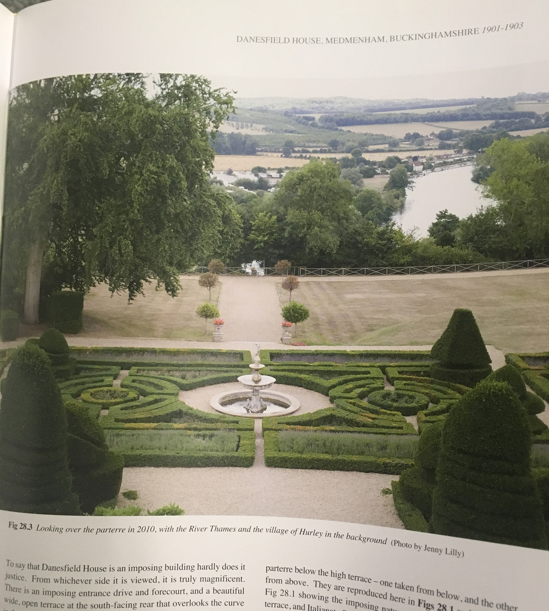
A little bit behind the scenes: after researching my personas saw they had “perfection” andsymmetry in common and that inspired me to look at baroque French gardens. That lead to art déco wall paper and that inspired me to draw a shape that works as a mosaic and with which you can cover big surfaces.

-Student project-
