
For the creation of this identity I was inspired by Andy, the owner. He not only is a grate wake boarder himself, he also knows what he’s doing when it comes in taking care and repairing wake board boats. The identity reflects his expertise and seriousness for business as well as the fun part of the sport.
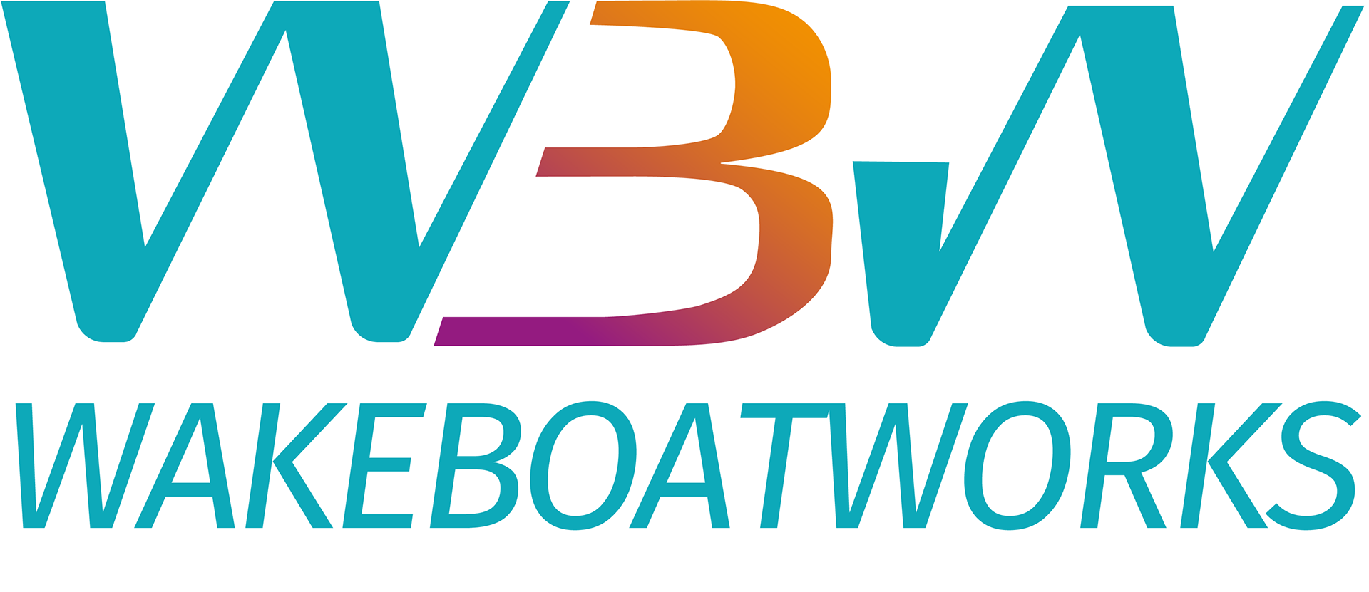
The feel of the logo shows the fun and boldness of the sport. The letters represent a boat in the middle of the lake and the colours of the B reminds Andy of a sunset after a day of wake boarding.
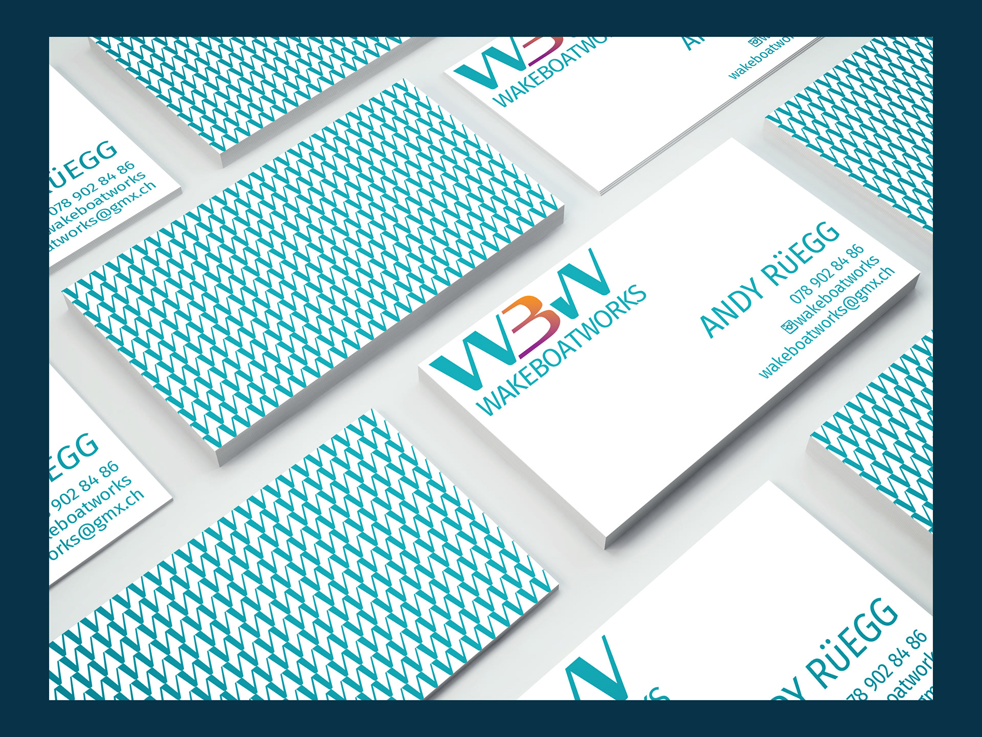
I also created this textures which represents the waves created by a wake board boat.
This was my first job as a freelancer. I learned how to keep track on time and deadlines; to trust the process I had learned and to explain my ideas to a client. Little gif for a look into different options for the graphic identity for Andy.
-Freelance work-